
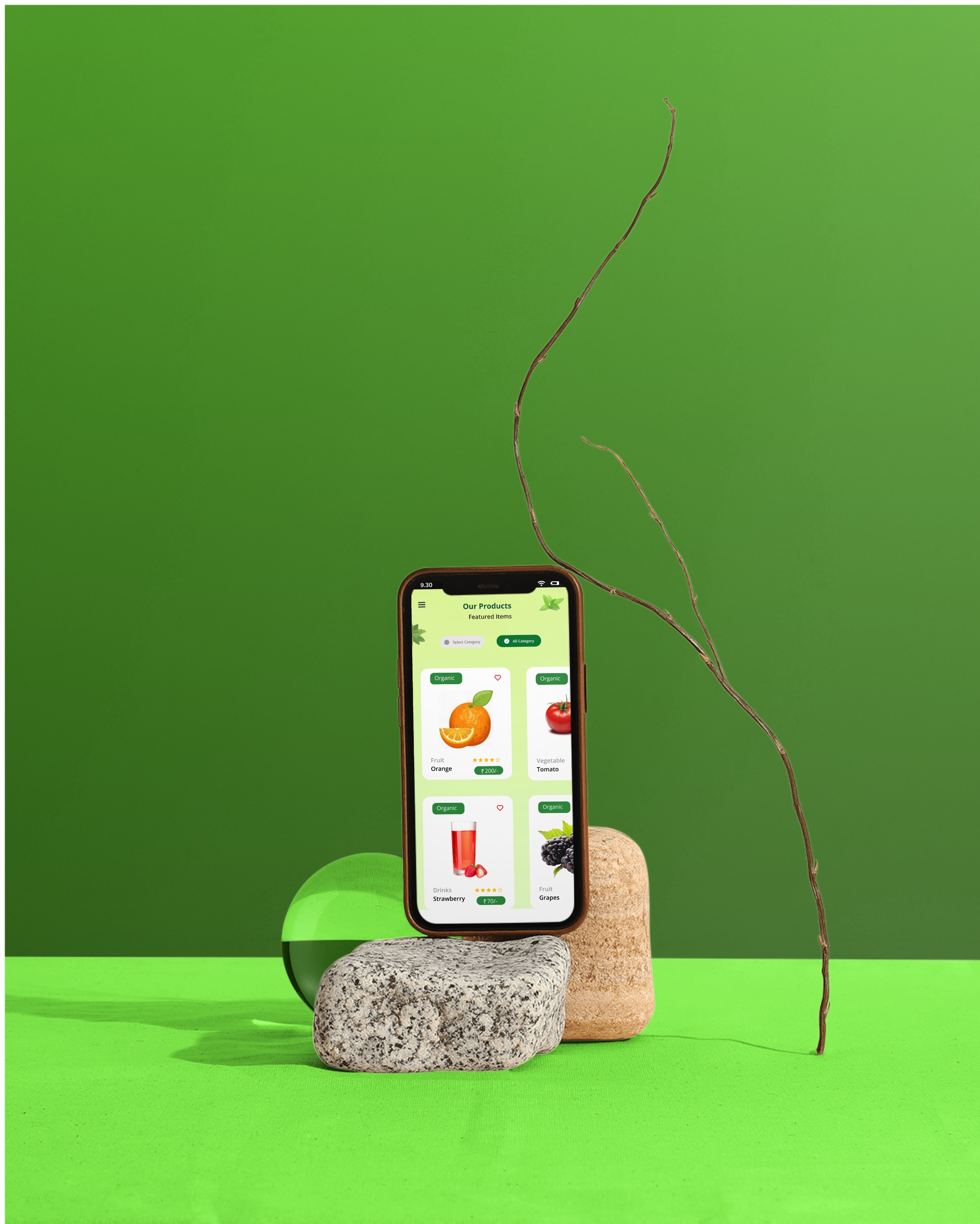
GREEN BITE
Target audience
USERS
Timeline
1 DAY
type
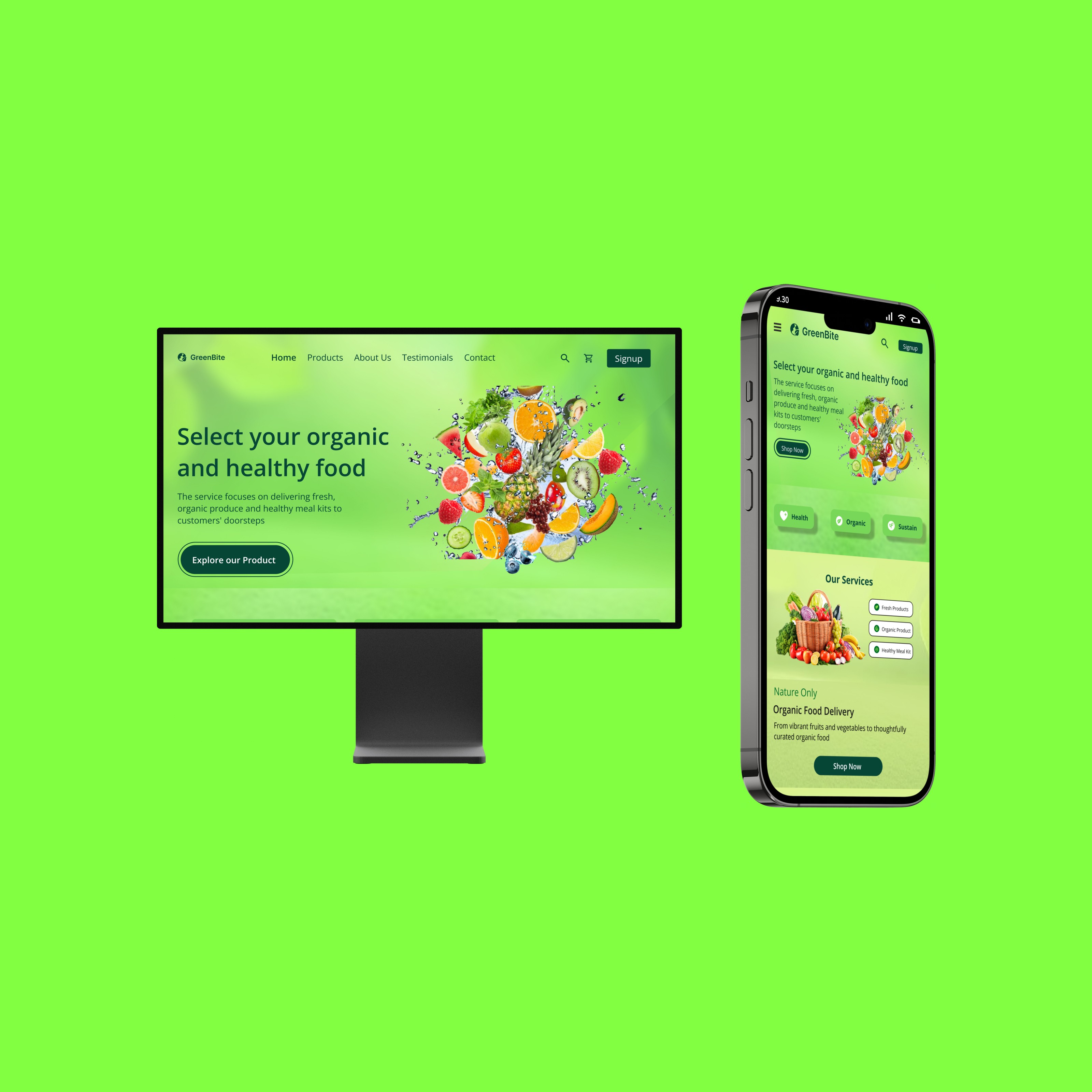
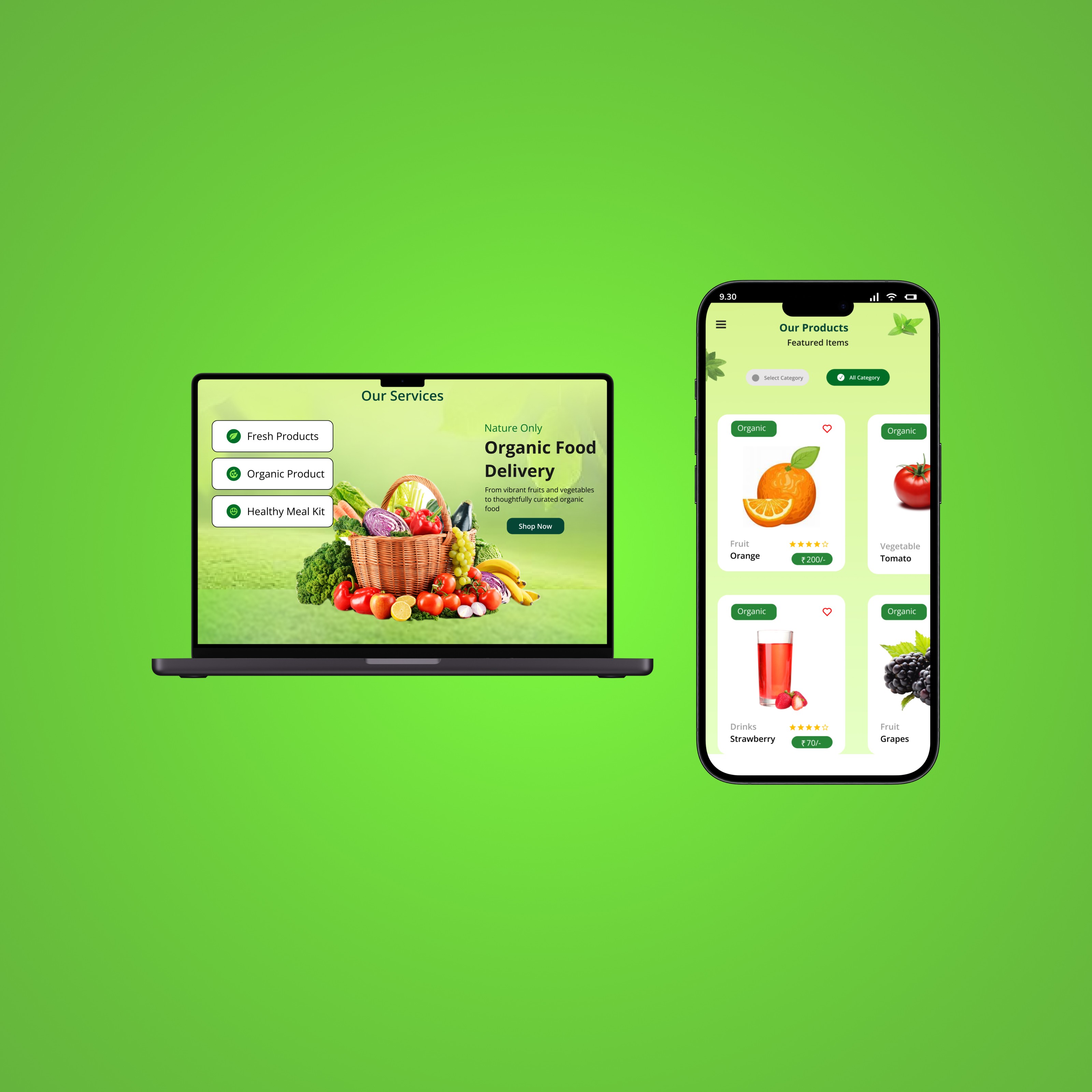
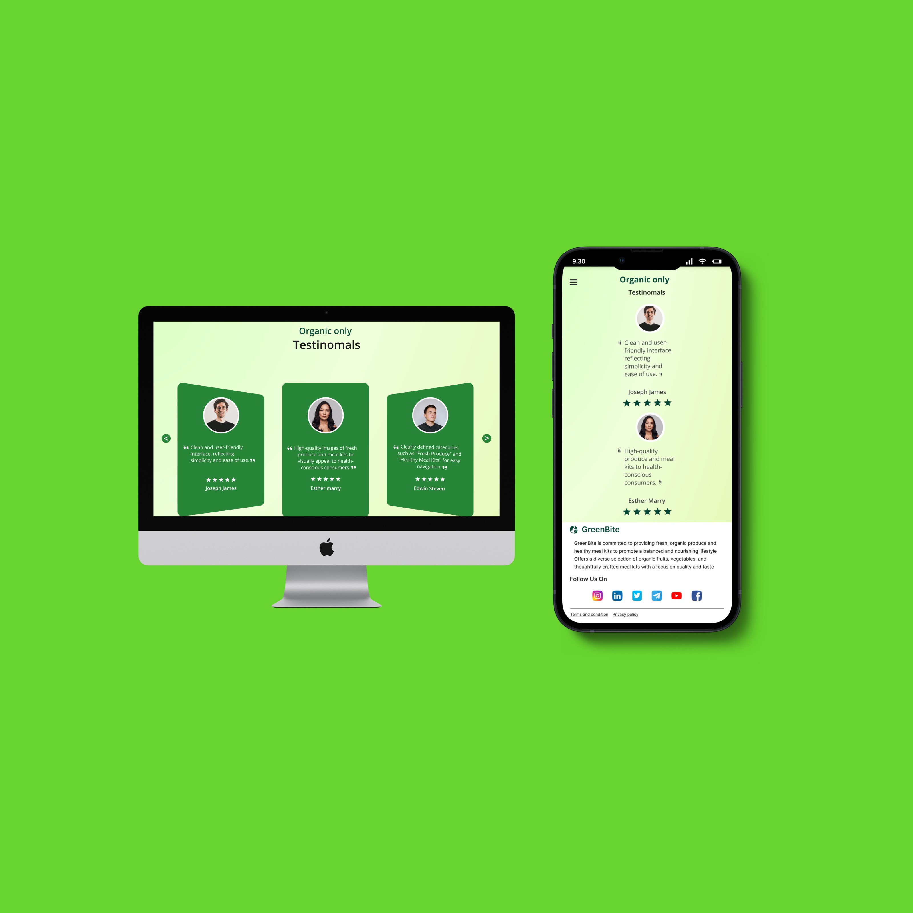
RESPONSIVE DESIGN
tool used
FIGMA
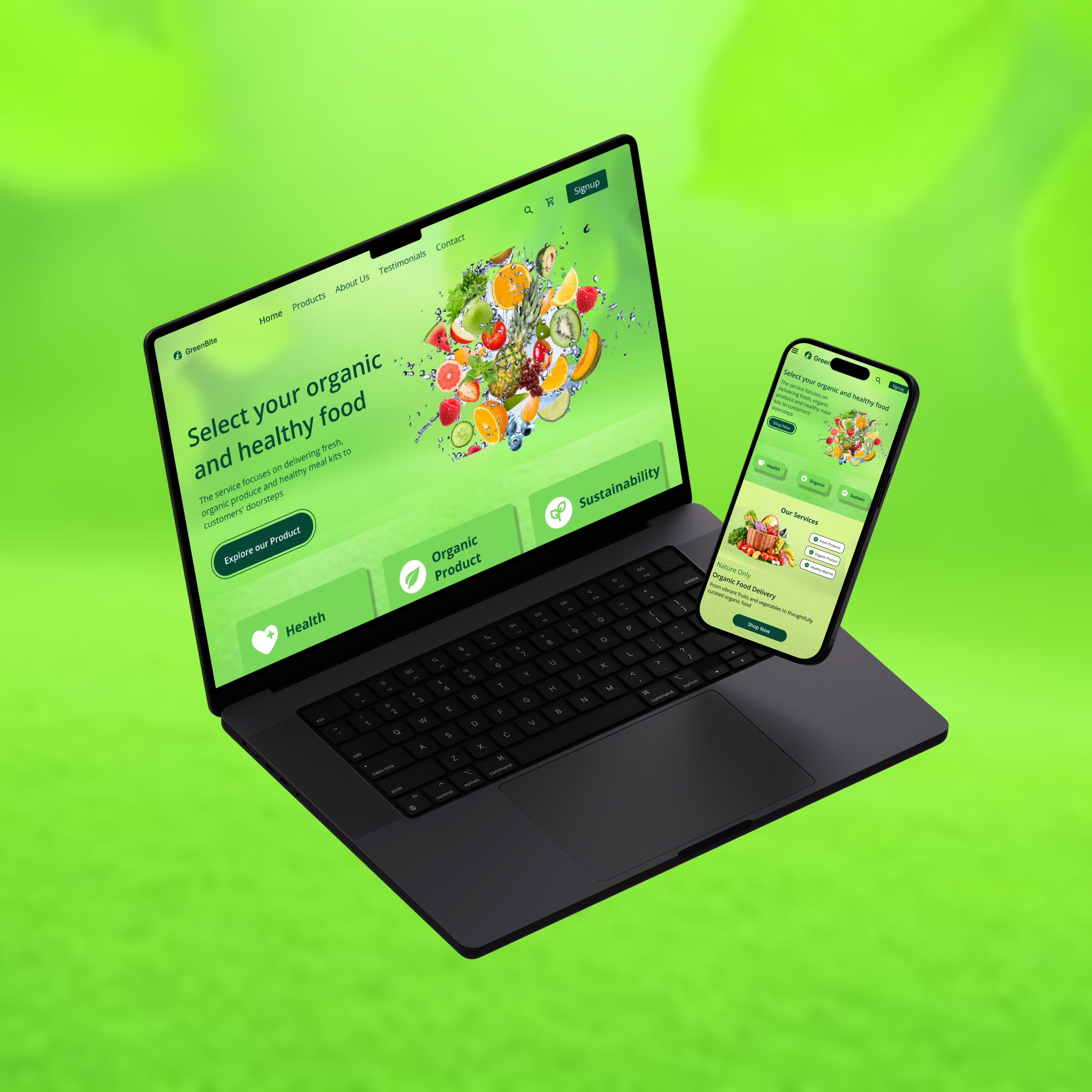
ABOUT PROJECT
PROBLEM STATEMENT
Designing a responsive user interface (UI) with exceptional user experience (UX) for a web application catering to diverse devices and screen sizes presents significant challenges. The primary goal is to ensure seamless interaction and optimal viewing experience across desktops, laptops, tablets, and smartphones
SOLUTION
Design intuitive navigation systems that remain accessible and user-friendly across different screen sizes, ensuring users can easily find and interact with essential features and information.Maintain consistency in visual elements, branding, and user interactions across all devices to reinforce the brand identity and provide a cohesive user experience. The project aims to create a responsive UI/UX design that provides a seamless and delightful user experience across all devices, enhancing usability, engagement, and satisfaction for users interacting with the web application.
ACHIEVED USING UXUI
Designing a layout that adapts seamlessly to various screen sizes, resolutions, and orientations, ensuring that users have a consistent and optimal experience whether they're using a desktop or smartphone. Ensures that branding elements, colors, typography, and interface components remain consistent and recognizable regardless of the device. prominently displayed, while non-essential elements are gracefully scaled down or hidden on smaller screens to avoid clutter.
— View Full Project